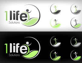
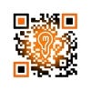
Logo Design for 1 Life
- Hali: Closed
- Zawadi: $290
- Wasilisho Zilizopokelewa: 7
- Mshindi: Lozenger

Maelezo ya Shindano
Main purpose is a fitness business, we do personal training, boot camps, group training. It is more than just a fitness business though, we also do life coaching to help motivate people to find their vocation or purpose in life. Very holistic beliefs in t
Ujuzi unaopendekezwa
Maoni ya Muajiri
“Lozenger was AMAZING to work with! So creative and had such a great understanding of what I wanted. Was patient with everything I asked of him. Was above and beyond any of the other designers as far as his style and creativity. His communication was GREAT and extremely timely, he never left me hanging. Very Professional!! I have an amazing logo thanks to him, I would definitely use him again!!!”
![]() Hemcminn, United States.
Hemcminn, United States.
Bodi ya Ufafanuzi ya Umma
-

Mwenye Shindano - Miaka 12 iliyopita
Thank you everyone for your hard work! I really appreciated all the other designs especially from Contestlover and Spahiu, you guys did a beautiful job as well!
- Miaka 12 iliyopita
-
contestlover
- Miaka 12 iliyopita
Thankyou sir :)...and congrats @Lozenger...I think the client picked the most worthy design :)
- Miaka 12 iliyopita
-

Lozenger
- Miaka 12 iliyopita
Thanks very much!
- Miaka 12 iliyopita
-

spahiu
- Miaka 12 iliyopita
Congratulations Lozenger! Great work :)
- Miaka 12 iliyopita
-
Lozenger
- Miaka 12 iliyopita
Many thanks!
- Miaka 12 iliyopita
-
Mwenye Shindano - Miaka 12 iliyopita
Just wanted to say that I thought #122 is beautiful and hated to reject it but just didn't express what my business does. Thank you though, thought it was really pure and clean!
- Miaka 12 iliyopita
-
mgleaf
- Miaka 12 iliyopita
Thanks for liking my entry.. If you had sent me PM i may add your business elements to it ...Thanks anyway :)
- Miaka 12 iliyopita
-

cotletcristian
- Miaka 12 iliyopita
Please rate for #249!
- Miaka 12 iliyopita
-
orbana
- Miaka 12 iliyopita
Thanks comment for #248 .
- Miaka 12 iliyopita
-
foxxed
- Miaka 12 iliyopita
#233 http://www.graphicsfactory.com/Clip_Art/People/Silhouette/160_492007_373873.html
- Miaka 12 iliyopita
-
foxxed
- Miaka 12 iliyopita
#231 #232 #234 - #236 = http://www.tineye.com/search/show_match/0d4e798ce5bbda4f1eab2bbf35317fae779ec6b1/528cf6371749ae64ab88b6e65c1a8fc9b63407a8bd9cf7e044320e124acfe20d?m13=16.158500&m21=-0.000463&m22=1.328060&m23=19.511600&m11=1.328060&m12=0.000463
- Miaka 12 iliyopita
-
ulogo
- Miaka 12 iliyopita
#239 Thanks!
- Miaka 12 iliyopita
-
Sarat1989
- Miaka 12 iliyopita
#230, #231, #232
- Miaka 12 iliyopita
-
cotletcristian
- Miaka 12 iliyopita
Can you guarantee the contest? Thank you!
- Miaka 12 iliyopita
-
Sarat1989
- Miaka 12 iliyopita
#220, #224, #225, #229,
- Miaka 12 iliyopita
-

gabico
- Miaka 12 iliyopita
hi! could you please check #214 Thank you
- Miaka 12 iliyopita
-

iffikhan
- Miaka 12 iliyopita
Please Review #207 Regards
- Miaka 12 iliyopita
-

GFXwizard
- Miaka 12 iliyopita
Please, take a look at #196, #197.
- Miaka 12 iliyopita
-
spahiu
- Miaka 12 iliyopita
#180
- Miaka 12 iliyopita
-

dsharma23
- Miaka 12 iliyopita
please check # 165....waiting for feedback
- Miaka 12 iliyopita
-
moinjavedahmed
- Miaka 12 iliyopita
plz check 142,143 & 144
i cant see 122 anywhere
thanks- Miaka 12 iliyopita
-
sirrom
- Miaka 12 iliyopita
please check #133 #134. thanks
- Miaka 12 iliyopita
-
Mwenye Shindano - Miaka 12 iliyopita
Ok I'm loving # 87 because you could separate the logo from the word mark and it still makes sense, also how it also shows growth but doesn't look too "planty"
- Miaka 12 iliyopita
-

dasilva1
- Miaka 12 iliyopita
please take a look in my entry #116
- Miaka 12 iliyopita
-
Mwenye Shindano - Miaka 12 iliyopita
To help clarify what I am looking for is a design that shows movement because it is a fitness business, I agree with Liam below that I won't be picking any design that has the V figurine guy in the design, I believe it is way overdone. I want my logo to be identifiable and almost look like a "stamp" before another word 1 Life Bootcamps, 1 Life Fit and so on. I love some of the creative figures on ones like #42 and #34 because they could almost stand alone like its own logo but it still ties into the word mark . I love the idea of showing growth and physical movement (without the V person)
- Miaka 12 iliyopita
-

prithaguptansit
- Miaka 12 iliyopita
check entires 94 and 96.Please send me feedbacks cause i am new to freelancer.com
- Miaka 12 iliyopita
-
prithaguptansit
- Miaka 12 iliyopita
sorry 98
- Miaka 12 iliyopita
-
srkdesigns
- Miaka 12 iliyopita
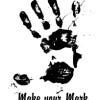
Do have a look at #81
Very simple and focused design.
Does not take away your attention in reading other forms.
The head and arms are your identity.Can be used on t-shirts or other areas.
Suggestion and Feedback would be really nice.- Miaka 12 iliyopita
-

LovaDesign
- Miaka 12 iliyopita
For your attention,
Hope you like it as much as I do #80
I would appreciate feedback. Thank You- Miaka 12 iliyopita
-

AbdulrhmanZaki
- Miaka 12 iliyopita
A new one #77 ;)
- Miaka 12 iliyopita
-

liamclisham
- Miaka 12 iliyopita
http://99designs.com/designer-blog/2011/12/09/what-not-to-do-overdone-and-overused-logos/ - Come on guys!
- Miaka 12 iliyopita
-
Murielle
- Miaka 12 iliyopita
Totally agree with you Liam! :}
- Miaka 12 iliyopita
-

ikamitrov
- Miaka 12 iliyopita
Check and feedback #68. regards
- Miaka 12 iliyopita
-

donekirov24
- Miaka 12 iliyopita
Please check out and feedback #67 and #58 ... Thanks
- Miaka 12 iliyopita
-
orbana
- Miaka 12 iliyopita
#66 Please .Thanks.
- Miaka 12 iliyopita
-
AbdulrhmanZaki
- Miaka 12 iliyopita
Simple an strong ;) #65
- Miaka 12 iliyopita
-
liamclisham
- Miaka 12 iliyopita
#62 and #63 please
- Miaka 12 iliyopita
-

desklamp
- Miaka 12 iliyopita
Please review #48 #49 #50 thanks :)
- Miaka 12 iliyopita
-
Mwenye Shindano - Miaka 12 iliyopita
My favorites are definitely #11, #16, #19 and # 12 I love the concepts of #17 & #18 however they may be too busy on a shirt or road sign.
- Miaka 12 iliyopita
-

ZemunDesign
- Miaka 12 iliyopita
thanks :D
- Miaka 12 iliyopita
-

aessis88
- Miaka 12 iliyopita
Hi, kindly check #41.. Thanks ^_^
- Miaka 12 iliyopita
-
ehardaway2
- Miaka 12 iliyopita
feedback would be greatly appreciated! on #40 thank you
- Miaka 12 iliyopita
-
SharpImage
- Miaka 12 iliyopita
#39 check plz
- Miaka 12 iliyopita
-
Mwenye Shindano - Miaka 12 iliyopita
On #25 I like the 1 and the L together but again I think it needs to be simplified because I don't think someone would be able to read it clearly. Love the concept of if but think it is too ornate and doesn't show the movement I would like. I do like the other ones but I do want a clear symbol so I can put that one symbol everywhere. I like #27 for that reason and the other ones I mentioned before.
- Miaka 12 iliyopita
-
desklamp
- Miaka 12 iliyopita
Hi! Please review #25 #26 #28 #29 #30 #31 and give feedback. Thanks!
- Miaka 12 iliyopita
-
overTHEgame
- Miaka 12 iliyopita
Hi,
My logo #23 suggestions has a symbolic meaning:
the Morning star means a new start of the day
the sun like symbol means independent movement
the whole symbol means - I change or I transform my life, or life transformation.
If you'd like to see some more variations of this concept - let me know!
Best regards
overTHEgame- Miaka 12 iliyopita
-
Lozenger
- Miaka 12 iliyopita
Just submitted #11, #16 and #19. Any feedback would be greatly appreciated!
- Miaka 12 iliyopita
-
ZemunDesign
- Miaka 12 iliyopita
#18
can you guarante contest and sealed?
Thanks- Miaka 12 iliyopita
Jinsi ya kuanza kwa kutumia mashindano
-

Chapisha Shindano Lako Haraka na rahisi
-

Pokea Wasilisho Nyingi Kutoka kote ulimwenguni
-

Tuza wasilisho bora zaidi Pakua faili - Rahisi!