Logo design for costmetics and beauty startup
- Hali: Closed
- Zawadi: $60
- Wasilisho Zilizopokelewa: 26
- Mshindi: gfxbucket

Maelezo ya Shindano
Hello Designers,
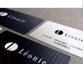
We need a logo for a company called "Léonie" (with an accent on the e, alt-131) which will carry beauty products such as acne creams, facial masks, anti-wrinkle serum, nail polish, etc.
Our target market is women aged 25-45 so we want a classy and professional logo that will appeal primarily to women in that age range.
We want a logo that is mostly type-based with an OPTIONAL graphical element.
See http://www.hongkiat.com/blog/fonts-used-logos-popular-brands/ for inspiration.
Notes:
- WE PREFER CUSTOMIZED TYPEFACE LOGOS. See link above for examples.
- We will be happy with a good font selection and a little customization, no need to go all out on designing a graphical element.
- Please avoid gradients
- We want a color and a black and white version of the logo
- It must not look like any other beauty brand logo. It must be original and stand out.
We need the logo in different file formats for print, web and media. Please provide the base font used as well.
Thanks and happy bidding!
Ujuzi unaopendekezwa
Maoni ya Muajiri
“Awesome designer, fast communication, knows his business. Recommended!”
![]() emailxcoder, Canada.
emailxcoder, Canada.
Bodi ya Ufafanuzi ya Umma
-

badcom
- Miaka 11 iliyopita
Congratz @ gfxbucket
- Miaka 11 iliyopita
-

Don67
- Miaka 11 iliyopita
please check my logo thanks
- Miaka 11 iliyopita
-

DruMita
- Miaka 11 iliyopita
Ok. Take your time,there is a lot of good designs.
- Miaka 11 iliyopita
-

Mwenye Shindano - Miaka 11 iliyopita
Sorry guys I was away for a few days! Will check entries and comment today|
- Miaka 11 iliyopita
-

infojanunepal
- Miaka 11 iliyopita
plz review # 108# 110#111#112,#81..
- Miaka 11 iliyopita
-

Urushta
- Miaka 11 iliyopita
plz review #103,#104,#105,#79,#80.
- Miaka 11 iliyopita
-

masserrano
- Miaka 11 iliyopita
Hi! I just finished my design for your contest and I want to know what you think #86, please rate or feedback. Hope you like it, Thanks.
- Miaka 11 iliyopita
-
badcom
- Miaka 11 iliyopita
Any feedback, as we can continue to make improvements if needed?
- Miaka 11 iliyopita
-

AARTIST
- Miaka 11 iliyopita
#74
- Miaka 11 iliyopita
-

berryrepublic
- Miaka 11 iliyopita
Hi emailxcoder, I\'ve read the brief and created a customised typeface as requested. The text can be used with or without the flower design, and vice versa. My design is #72. I hope you like it, and I\'m happy to make any changes. Many thanks, Andy
- Miaka 11 iliyopita
-
DruMita
- Miaka 11 iliyopita
Hi, please find attached logo design #70 . Happy to do some amends if needed. Thanks for your consideration & looking forward to receiving your feedback!
- Miaka 11 iliyopita
-
AARTIST
- Miaka 11 iliyopita
#39
- Miaka 11 iliyopita
-
badcom
- Miaka 11 iliyopita
#69 is the same as 67, just in color. Is there a color you may prefer?
- Miaka 11 iliyopita
-
badcom
- Miaka 11 iliyopita
Your thoughts on #66 and #67. Feedback always appreciated. Thanks...
- Miaka 11 iliyopita
-

viccampos22
- Miaka 11 iliyopita
Please check my lastest updates, #63-#64-#65. Appreciate it!
- Miaka 11 iliyopita
-

grafixsoul
- Miaka 11 iliyopita
what about 22?
- Miaka 11 iliyopita
-

xahe36vw
- Miaka 11 iliyopita
Hi, #38 #40 #41 #42 #43 Please.. :)
- Miaka 11 iliyopita
-

boldarts
- Miaka 11 iliyopita
Feedback #60 of #11
- Miaka 11 iliyopita
-

upbeatdesignsnet
- Miaka 11 iliyopita
let me know how you feel about #15 , feedback is appreciated.
- Miaka 11 iliyopita
Tazama ujumbe 1 zaidi
-
upbeatdesignsnet
- Miaka 11 iliyopita
Certainly :)
- Miaka 11 iliyopita
-
upbeatdesignsnet
- Miaka 11 iliyopita
Please check #57 , I\'ve given you a few options on colors and lines as asked.
- Miaka 11 iliyopita
-
gfxbucket
- Miaka 11 iliyopita
Please leave a private feedback by simply clicking the username \"gfxbucket\" If you like design #28 ,#54 & #55. Thank you.
- Miaka 11 iliyopita
-
Mwenye Shindano - Miaka 11 iliyopita
#6 #7 #8) The name looks too imbalanced and unprofessional. Also the leaf does not fit our company. I don\'t like the colored lines either (plus they have a gradient which I do not want)
#9) I love the illustration of the girl! Is this a custom illustration or does it come from a free/paid vector? I really do not want to infringe on someone else\'s right. I don\'t like the font though. It\'s hard to read. Would it be possible to try to put the woman and the typeface separate?
#11) Please remove the \'beauty products\' tag. The font is OK however the L is imbalanced compared to the rest. I like the idea of using another color for the accent on the e.
Thanks guys and please keep \'em coming!- Miaka 11 iliyopita
-
Mwenye Shindano - Miaka 11 iliyopita
I prefer this one a lot more than the previous one, thanks! My partner doesn\'t like the image though (too big for the logo). I\'ll keep your design in mind; we might be able to work something out with the illustration
- Miaka 11 iliyopita
-

brandonLee24
- Miaka 11 iliyopita
Ok well i made you another preview with the illustration a lot smaller. Let me know what you think.
- Miaka 11 iliyopita
-

won7
- Miaka 11 iliyopita
Please feedback
- Miaka 11 iliyopita
-
Mwenye Shindano - Miaka 11 iliyopita
I really like the idea with the \"n\"! I would like to see the line go from the start to the end, and change the L to normal font weight. I don\'t really like this font though.
- Miaka 11 iliyopita
-

solankibhavin
- Miaka 11 iliyopita
PLease review #52
- Miaka 11 iliyopita
-
Mwenye Shindano - Miaka 11 iliyopita
#23 Nice font, please remove image and customize the font a little bit. Maybe change colors?
#28 Awesome work, its great to see how it could look on a business card. I like the font and spacing as well, but the L in the blue circle make it look too \"masculine\".. can you submit some variations with a more feminie look?
#38 Good font selection, please remove the graphical element and try other color themes- Miaka 11 iliyopita
-

sat01680
- Miaka 11 iliyopita
About #16 & #17
- Miaka 11 iliyopita
-
Mwenye Shindano - Miaka 11 iliyopita
#16 I don\'t like, #17 has a good color (purple) but I don\'t like the font.
- Miaka 11 iliyopita
-

Phphtmlcsswd
- Miaka 11 iliyopita
What about #18 did u like Sir,?
- Miaka 11 iliyopita
-
Mwenye Shindano - Miaka 11 iliyopita
Sorry, it doesn\'t fit our expectations.
- Miaka 11 iliyopita
-
sat01680
- Miaka 11 iliyopita
also #19
- Miaka 11 iliyopita
-
Mwenye Shindano - Miaka 11 iliyopita
I like the font and the colors but not the element. Can you try removing the graphical element and play with the font/color?
- Miaka 11 iliyopita
-
infojanunepal
- Miaka 11 iliyopita
plez check #46
- Miaka 11 iliyopita
-
Mwenye Shindano - Miaka 11 iliyopita
Sorry, I don\'t like the font or the graphical element.
- Miaka 11 iliyopita
-
Mwenye Shindano - Miaka 11 iliyopita
Hi designers,
Here are my comments:
#1) Nice, but the leaf does not fit our products line since we do not carry \"Natural products\". Font chosen is nice, but too simple.
#2) Good try, but the name is hard to read, the color is too light and the lion does not fit our company.
#3) I like the script font, not sure about the pink color and the stars though. Also please remove the \'beauty products\' tag. Of the 4 examples, I prefer the black on white one.
#4) Nice try, but I don\'t want the leaf. Font is also too simple.- Miaka 11 iliyopita
-
badcom
- Miaka 11 iliyopita
Thanks for your feedback, I will rework #3 for you shortly...
- Miaka 11 iliyopita
-
won7
- Miaka 11 iliyopita
sir, feedback please
- Miaka 11 iliyopita
-
boldarts
- Miaka 11 iliyopita
Hope you like #11
- Miaka 11 iliyopita
-
brandonLee24
- Miaka 11 iliyopita
#9. I repeat, my design is not done, If you choose mine i will clean it and modify it.
- Miaka 11 iliyopita
-
brandonLee24
- Miaka 11 iliyopita
Please give me some feed back on this, I could still modify it.
- Miaka 11 iliyopita
-
badcom
- Miaka 11 iliyopita
Any thoughts on #3. Feedback appreciated. Thanks
- Miaka 11 iliyopita
-
viccampos22
- Miaka 11 iliyopita
Look #2, Feel free to tell me what you want to modify.
- Miaka 11 iliyopita
Jinsi ya kuanza kwa kutumia mashindano
-

Chapisha Shindano Lako Haraka na rahisi
-

Pokea Wasilisho Nyingi Kutoka kote ulimwenguni
-

Tuza wasilisho bora zaidi Pakua faili - Rahisi!