Design a Logo for a stamp business
- Hali: Closed
- Zawadi: $30
- Wasilisho Zilizopokelewa: 84
- Mshindi: pkapil

Maelezo ya Shindano
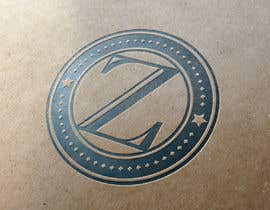
I have a small business where I make stamps. Address stamps, signature stamps, monogram stamps, etc.
I'm looking for a new logo to establish a new brand around. Simple is the key.
I'm open to colors, concepts, and ideas - as long as it's simple & clean.
*** Key Requirements ***
1. I'm looking for only 1 primary logo. The logo should be appropriate for a white background. However, from the winning logo, I will be creating 1 or 2 alternative color schemes that will be used on dark backgrounds.
2. Blue & white are the primary colors I have in mind but I'm not set on those. Feel free to offer alternatives.
3. Logo MUST be in vector format and at a minimum, I will need a .eps file but preferably a .ai file from the winner. The .ai version is irrelevant.
4. In the logo I need the letter "Z" to be the primary element.
5. Simple is the #1 requirement - something that will reproduce easily on print and web.
I've attached 1 concept file that I'm not exactly crazy about but one that should give an idea of what I'm looking for.
Thank you in advance.
Ed
Ujuzi unaopendekezwa
Maoni ya Muajiri
“Delivered as promised.”
![]() edwait, United States.
edwait, United States.
Bodi ya Ufafanuzi ya Umma
-

nestos100
- Miaka 10 iliyopita
Greetings Mr. Edwait and Mr. pkapil. I have one question for you both gentlemen... do you find this right? Mr. pkapil, a designer of your status can behave like this? You liked my design, you almost copied by 95% and you are proud for that? Mr. Edwait, do you find this right? It would be a lot easier for you to inform me for any kind of improvement on my logo and give you what you want. You didn't sir.... and instead of that you chose Mr pkapil's design, my design. Very disappointing gentlemen, for both of you. Shame. Good day!
- Miaka 10 iliyopita
-

Mwenye Shindano - Miaka 10 iliyopita
I understand your concern. However, when you get down to it, you both basically copied my concept with a little embellishment. I'm not sure what stopped you from mentioning that you felt copied earlier and offer some close or exact alternatives to theirs. In the end, I went with the one that appealed to me the most.
With that said, I'm not going to be using any of them, including pkapil's. None really are what I want and have been working on my end to develop my own design.- Miaka 10 iliyopita
-
nestos100
- Miaka 10 iliyopita
The letter "Z" in the middle of a cyrcle can be presented in hundred ways. But pkapil used the same font, almost the same rings, the stars on the left and right and all these after the presentation of my artwork. In a private contest, pkapil would have been far away from my design. But lets consider that pkapil is a copy designer and he gives his best shot to copy other artworks, i was expecting from you to mention that. I didn't post anything about it because i thought it was obvious, and if you had minimum sense of justice you would have rejected pkapil's artwork. But i guess that belongs into a romantic, ideal world... We keep blaming previous generations for the legacy they left us, but we can't see that we keep repeating the same mistakes.
Friendly tip: Next time try a private contest... a lot better for everyone. Good day!- Miaka 10 iliyopita
-

vladspataroiu
- Miaka 10 iliyopita
Hello, feedback welcomed for #147 and #148 . Thanks.
- Miaka 10 iliyopita
-

SLDrago
- Miaka 10 iliyopita
#100 is good?
- Miaka 10 iliyopita
-

kovandzhiev
- Miaka 10 iliyopita
This is my first job 10 years ago.:)))) I have a video clip on YouTube Illustrator and Photoshop Tutorial How to Make Stamps-uploaded by seen 145 000 .:))
- Miaka 10 iliyopita
-

preethamdesigns
- Miaka 10 iliyopita
Please Feedback on #132
- Miaka 10 iliyopita
-
preethamdesigns
- Miaka 10 iliyopita
Please Feedback on #129
- Miaka 10 iliyopita
-
preethamdesigns
- Miaka 10 iliyopita
Please Feedback on #127
- Miaka 10 iliyopita
-

FireDesigner
- Miaka 10 iliyopita
color change as you need....just show you some variation....
- Miaka 10 iliyopita
-

akritidas21
- Miaka 10 iliyopita
please check #119 #120
- Miaka 10 iliyopita
-
nestos100
- Miaka 10 iliyopita
Hope you like #110
- Miaka 10 iliyopita
Tazama jumbe 2 zaidi
-
SLDrago
- Miaka 10 iliyopita
Check this #100 :)
- Miaka 10 iliyopita
-

ahsanmaredia
- Miaka 10 iliyopita
RATE #89. IT IS PERFECT AS YOUR GIVEN INFORMATON. THANKS. REPLY BACK FOR CHANGES
- Miaka 10 iliyopita
-
preethamdesigns
- Miaka 10 iliyopita
Please Feedback #85
- Miaka 10 iliyopita
-
preethamdesigns
- Miaka 10 iliyopita
Please Feedback #83
- Miaka 10 iliyopita
-

igorprole
- Miaka 10 iliyopita
I drew another example.
Please see #58
I'd love to hear your opinion
Thx- Miaka 10 iliyopita
-
kovandzhiev
- Miaka 10 iliyopita
- Miaka 10 iliyopita
-

vsourse009
- Miaka 10 iliyopita
Provide feedback on my entries #65, #67 and #70
- Miaka 10 iliyopita
-

terosdan
- Miaka 10 iliyopita
pls #69
- Miaka 10 iliyopita
-
akritidas21
- Miaka 10 iliyopita
please rate and give feedback #50 #51 #52 #53 #54
- Miaka 10 iliyopita
-
akritidas21
- Miaka 10 iliyopita
please check #60 #61
- Miaka 10 iliyopita
-
igorprole
- Miaka 10 iliyopita
Please see #39 , i drew another example.
I'd love to hear your opinion
Thx- Miaka 10 iliyopita
-
Mwenye Shindano - Miaka 10 iliyopita
I like #39 . Not the font.. but the concept..
- Miaka 10 iliyopita
-
Mwenye Shindano - Miaka 10 iliyopita
I've Added an additional file for further inspiration.
I'm not set on a circle, square, or any other shape. I'm leaning towards using Kraft Paper for my business cards and letterhead.
Here's a link for even further inspiration or explanation... http://payload79.cargocollective.com/1/7/230955/3895892/Harlex%20namecard%2003_905.jpg- Miaka 10 iliyopita
-

machine4arts
- Miaka 10 iliyopita
42 in differents colors . . .feedback plz
- Miaka 10 iliyopita
-

dizaraj
- Miaka 10 iliyopita
Have a look on #41 and give your feedback please
- Miaka 10 iliyopita
-

artgis
- Miaka 10 iliyopita
Hello! Please checkout #12 . Thanks!
- Miaka 10 iliyopita
-
Mwenye Shindano - Miaka 10 iliyopita
So far, This one has the most appeal but it's still "too templateish" ...
- Miaka 10 iliyopita
-
artgis
- Miaka 10 iliyopita
Thank you for the feedback. I have made another logo. Please check #40.
- Miaka 10 iliyopita
-
igorprole
- Miaka 10 iliyopita
Please see #17
I'd love to hear your opinion
Thx- Miaka 10 iliyopita
-
Mwenye Shindano - Miaka 10 iliyopita
I like it. I think I'd like it better if the Z were to have a little more focus though. Also, I like the shadow element but keep in mind my requirement is a vector file. If you're doing that in Photoshop, it would need to be exported as a vector...
- Miaka 10 iliyopita
-
igorprole
- Miaka 10 iliyopita
Okay, I'll try a few more examples,
and this was done in illustrator, but is imported into photoshop that I made examples.- Miaka 10 iliyopita
-
Mwenye Shindano - Miaka 10 iliyopita
Also, I make stamps.. as in Address Stamps, Notary Stamps, etc... NOT postage stamps..
- Miaka 10 iliyopita
-

TopPros
- Miaka 10 iliyopita
see #27
- Miaka 10 iliyopita
-
Mwenye Shindano - Miaka 10 iliyopita
I was just looking at yours. Interesting but I'm not sure what the rectangles on the left are.... it would definitely be better without them...
- Miaka 10 iliyopita
-

Lianaoprea
- Miaka 10 iliyopita
any thoughts on #21 ? thank you
- Miaka 10 iliyopita
-
Mwenye Shindano - Miaka 10 iliyopita
I like the loop around it but the Z is not bold enough...
- Miaka 10 iliyopita
-
Lianaoprea
- Miaka 10 iliyopita
just uploaded #24
- Miaka 10 iliyopita
-
Mwenye Shindano - Miaka 10 iliyopita
I debated whether or not to put up my example. So far, I think it was a mistake. Don't be afraid to do something totally different from what I showed as an example.
- Miaka 10 iliyopita
-
Mwenye Shindano - Miaka 10 iliyopita
Just to clarify. The "Z" in my example is only and example. I'm not set on that particular font or even that it has to be a font at all.
- Miaka 10 iliyopita
-

keiabillon
- Miaka 10 iliyopita
edwait
- Miaka 10 iliyopita
Jinsi ya kuanza kwa kutumia mashindano
-

Chapisha Shindano Lako Haraka na rahisi
-

Pokea Wasilisho Nyingi Kutoka kote ulimwenguni
-

Tuza wasilisho bora zaidi Pakua faili - Rahisi!