Ebook Cover Design

  • Hali: Closed
  • Zawadi: $75
  • Wasilisho Zilizopokelewa: 29
  • Mshindi: malithdk

Maelezo ya Shindano

I am looking to have a digital cover designed for a Credit Repair book that shows people several different strategies to boost their credit scores.
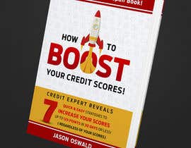
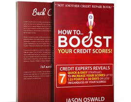
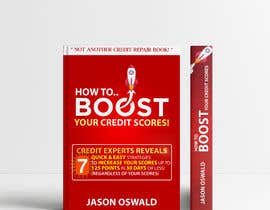
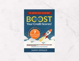
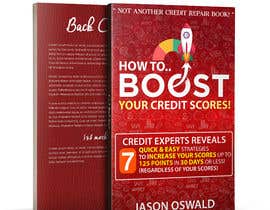
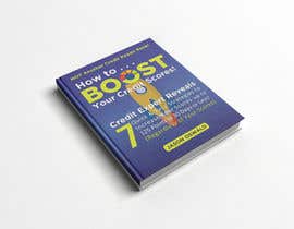
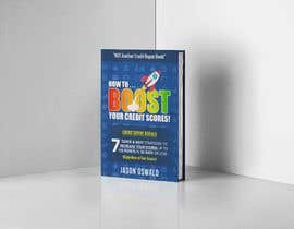
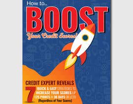
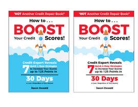
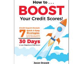
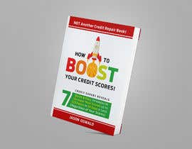
The book title is:
How to . . .
BOOST
Your Credit Scores!

(See attached image and text)

The cover has to be professional and attention grabbing. I do not want this cover to look like all the other dull, unimaginative and recycled book covers on credit repair. So please DO NOT look at other credit repair books and try to copy their designs. If I see any copied designs, I will immediately decline your submission.

Also please put some emphasis on the following words by making them bold (see attachment):

Quick & Easy
Increase your Scores
125 Points
30 Days
Regardless of Your Scores

Some thoughts that I had for the book cover is to have some rockets shooting up or diagonally or to have the word BOOST in the colors of a Credit Gauge.

I sort of like the rockets on the following book cover:

https://kindlepreneur.com/amazon-kindle-rankings-2/

If you decide to use rockets, I would be looking for more professional looking rockets.

If you are unfamiliar with what credit repair, credit improvement, credit scores or credit score boosting is, please do a Google Search. Again, please DO NOT copy other peoples designs as most of book covers in this field are boring and dull.

Good Luck with your submissions.

P.S. If you don't feel the "Credit Experts Reveal" works with the book cover lay-out, feel free to leave it out.

Ujuzi unaopendekezwa

Maoni ya Muajiri

“Impressed! is the only word to describe working with Malith for my cover design. He is extremely talented and brought my vision to life in a very unique way. I will definitely work with Malith in the future. ”

Picha ya Profaili jloswald38, United States.

Wasilisho kuu kwenye hili shindano

Angalia wasilisho zaidi

Bodi ya Ufafanuzi ya Umma

  • neharasheed876
    neharasheed876
    • Miaka 4 iliyopita

    please let me know any major or minor change you need across all of my entries even after contest ends thank you! :)

    • Miaka 4 iliyopita
  • ashishmehta591
    ashishmehta591
    • Miaka 4 iliyopita

    #108

    • Miaka 4 iliyopita
  • neharasheed876
    neharasheed876
    • Miaka 4 iliyopita

    #107 CHECK PLEASE

    • Miaka 4 iliyopita
  • neharasheed876
    neharasheed876
    • Miaka 4 iliyopita

    PLEASE CHECK #106 AND LEAVE FEEDBACK :) THANK YOU :)

    • Miaka 4 iliyopita
  • ashishmehta591
    ashishmehta591
    • Miaka 4 iliyopita

    #105

    • Miaka 4 iliyopita
  • neharasheed876
    neharasheed876
    • Miaka 4 iliyopita

    #102 #103 :)

    • Miaka 4 iliyopita
  • neharasheed876
    neharasheed876
    • Miaka 4 iliyopita

    PLEASE RATE AND PROVIDE FEEDBACK ON #101 #98 #97 :)

    • Miaka 4 iliyopita
  • jloswald38
    Mwenye Shindano
    • Miaka 4 iliyopita

    Md R., thank you for your submission, but there is nothing unique or interesting about your cover design. I don't feel there is anything that sets it apart from other designs or grabs my attention like other designs do.

    • Miaka 4 iliyopita
  • mdrahad114
    mdrahad114
    • Miaka 4 iliyopita

    please check #99, #100

    • Miaka 4 iliyopita
  • jloswald38
    Mwenye Shindano
    • Miaka 4 iliyopita

    Neha, (86 & 90)

    I would like to see the How to next to each other to the left of the rocket.
    "How to" should be a lot smaller. The focus is on the word BOOST and Your Credit Scores.

    I like the brightness of 86.

    On top of the book, the "NOT Another Credit Repair Book" needs to be larger and wider. That needs to stand out.

    I like the Gold text of 90.

    • Miaka 4 iliyopita
    1. neharasheed876
      neharasheed876
      • Miaka 4 iliyopita

      thank you for giving feedback! working on it right away :) hope you will like the updated version :)

      • Miaka 4 iliyopita
    2. neharasheed876
      neharasheed876
      • Miaka 4 iliyopita

      please check #98 #97

      • Miaka 4 iliyopita
  • jloswald38
    Mwenye Shindano
    • Miaka 4 iliyopita

    Ana Luisa D, if you are going to submit something you should do it within the next few hours as this contest will be closing in 16 hours.

    • Miaka 4 iliyopita
  • jloswald38
    Mwenye Shindano
    • Miaka 4 iliyopita

    Owais A, thank you for your submission, but the design does not align with what I am looking for. It is not clean, it's cluttered and chaotic. In addition, it is dark and I do not connect with the color selection.

    • Miaka 4 iliyopita
  • neharasheed876
    neharasheed876
    • Miaka 4 iliyopita

    please provide feedback for improvement #90 :)

    • Miaka 4 iliyopita
  • jloswald38
    Mwenye Shindano
    • Miaka 4 iliyopita

    Sohel, thank you for your submissions, but these are not designs that align with what I am looking for. '

    • Miaka 4 iliyopita
  • neharasheed876
    neharasheed876
    • Miaka 4 iliyopita

    please check #86 and leave feedback :)

    • Miaka 4 iliyopita
  • mrdeveloperus
    mrdeveloperus
    • Miaka 4 iliyopita

    Please Check #82

    • Miaka 4 iliyopita
  • colorss
    colorss
    • Miaka 4 iliyopita

    DEAR CONTEST HOLDER Please check my entry #83 and give feedback

    • Miaka 4 iliyopita
  • AbdullahDesign24
    AbdullahDesign24
    • Miaka 4 iliyopita

    Please Check #79 #80

    • Miaka 4 iliyopita
  • neharasheed876
    neharasheed876
    • Miaka 4 iliyopita

    PLEASE CHECK AND LEAVE FEEDBACK ON #77 #78

    • Miaka 4 iliyopita
  • neharasheed876
    neharasheed876
    • Miaka 4 iliyopita

    will submit design soon please don't close early :)

    • Miaka 4 iliyopita
    1. jloswald38
      Mwenye Shindano
      • Miaka 4 iliyopita

      Neha, I won't be closing early. I am letting the contest run for the full 7 days.

      • Miaka 4 iliyopita
    2. neharasheed876
      neharasheed876
      • Miaka 4 iliyopita

      thank you

      • Miaka 4 iliyopita
  • jloswald38
    Mwenye Shindano
    • Miaka 4 iliyopita

    Information about #7:

    This is a posting for everyone in regards to the #7 on the book title.

    I like the examples of the #7 in 58, 59 and 47.

    To me these stand out more and are more prominent.

    • Miaka 4 iliyopita
  • jloswald38
    Mwenye Shindano
    • Miaka 4 iliyopita

    Rade R, thank you for your submissions, but I do not want any type of gauges in the submissions. Gauges are overused in the credit repair industry and I am not trying to copy something that has been used in almost every credit repair book.

    • Miaka 4 iliyopita
  • redAphrodisiac
    redAphrodisiac
    • Miaka 4 iliyopita

    #75! Thank you

    • Miaka 4 iliyopita
  • jloswald38
    Mwenye Shindano
    • Miaka 4 iliyopita

    MD Sajib, thank you for your submission, but these are extremely unprofessional and do not align with what I am looking for. There are far better designs that you should be trying to compete with.

    • Miaka 4 iliyopita
    1. aliGFX777
      aliGFX777
      • Miaka 4 iliyopita

      Thanks for your Valued Feedback. I understand My design is pretty much unconventional and I am not always the safest option, most or art directors are not accustomed to see these type of designs. I am putting a reference for this
      graphic trend in entry no. 69 Thanks for your time, Have a great day. Regards : Ali Rehman

      • Miaka 4 iliyopita
  • aliGFX777
    aliGFX777
    • Miaka 4 iliyopita

    Hello There ! It is very Interesting project. I enjoyed working on this project. Kindly check my entry number 63, Hope so you will like it. It required much effort because here is quite tough competition and many freelancers did great work.Looking forward for your valued Feedback Regards: Ali Rehman

    • Miaka 4 iliyopita
  • jloswald38
    Mwenye Shindano
    • Miaka 4 iliyopita

    #47 MD Shovon S, thank you for your submission. You are heading in the right direction, but I don't like the text under Boost.

    • Miaka 4 iliyopita
  • jloswald38
    Mwenye Shindano
    • Miaka 4 iliyopita

    Anilava B, I actually liked your original design, you just had to do some work on the "7" and the text next to it. I like the 7 in your new book 37. I like the 7 from yours and also #47 .

    • Miaka 4 iliyopita
  • jloswald38
    Mwenye Shindano
    • Miaka 4 iliyopita

    Anilava B, thank you for your submission. I like the Boost & Rocket, but the "7" and text drown each other out.

    • Miaka 4 iliyopita
    1. talk2anilava
      talk2anilava
      • Miaka 4 iliyopita

      Thank you, hope the new design entry #59 is something different from the trend. Let me know, how could i make it more stand out. Your suggestion's will be highly appreciable.

      • Miaka 4 iliyopita
  • jloswald38
    Mwenye Shindano
    • Miaka 4 iliyopita

    Kevin, thank you for the submission. I like the rocket, but the word BOOST has way to much stuff going on with it and I feel it's hard on the eyes.

    • Miaka 4 iliyopita
  • jloswald38
    Mwenye Shindano
    • Miaka 4 iliyopita

    Ritesh T, thank you for your design submission. I would like to see the text "Not Another Credit Repair Book" in a bar on top of the book. So you could make the bar yellow and the text white. Please make this change and submit a new design. Thanks.

    • Miaka 4 iliyopita
    1. techitree1
      techitree1
      • Miaka 4 iliyopita

      OK I will do... I hope you have seen both design options.

      • Miaka 4 iliyopita
    2. techitree1
      techitree1
      • Miaka 4 iliyopita

      As per your feedback, I have changed in design and submit again.
      https://www.freelancer.com/contest/Ebook-Cover-Design-1662667-byentry-32544118
      new entry #51 .
      please check and let me know if any changes required.

      • Miaka 4 iliyopita
  • jloswald38
    Mwenye Shindano
    • Miaka 4 iliyopita

    malithdk thanks for your submission on 37. What I think would make this look good is to have some financial icons as the background like the book cover Image I posted with the project. Please look at the link in my contest/project posting to get a feel of that.

    • Miaka 4 iliyopita
    1. malithdk
      malithdk
      • Miaka 4 iliyopita

      Sure i ll work on it with some tweaks !

      • Miaka 4 iliyopita
  • jloswald38
    Mwenye Shindano
    • Miaka 4 iliyopita

    So Y, thank you for your submissions. I like the direction you are going and like how you have formatted the Subtitle - it looks good and reads well. :) Only suggestion I have for now would be to underline the words "Increase Your Scores"

    • Miaka 4 iliyopita
  • jloswald38
    Mwenye Shindano
    • Miaka 4 iliyopita

    MD Sajib, thank you for your submission but this is not what I am looking for.

    • Miaka 4 iliyopita
  • Ovijitkumar7
    Ovijitkumar7
    • Miaka 4 iliyopita

    Ok sir.

    • Miaka 4 iliyopita
  • jloswald38
    Mwenye Shindano
    • Miaka 4 iliyopita

    MD Shariful, Your color scheme does not align with what I am looking for. You have to much going on with the text, fonts and colors and there is no flow. Your Cover IS Chaos! - which is not a good thing.

    • Miaka 4 iliyopita
  • Ovijitkumar7
    Ovijitkumar7
    • Miaka 4 iliyopita

    Now It's your time to choose a design. Best of luck to my side. Have a good day sir.

    • Miaka 4 iliyopita
    1. jloswald38
      Mwenye Shindano
      • Miaka 4 iliyopita

      Ovijit, this contest is scheduled for 7 days and I plan on keeping it open for 7 days to give everyone an opportunity to submit an entry for review.

      • Miaka 4 iliyopita
  • jloswald38
    Mwenye Shindano
    • Miaka 4 iliyopita

    Nikhil K, thank you for the cover design, there is just to much going on with this cover.

    • Miaka 4 iliyopita
  • Ovijitkumar7
    Ovijitkumar7
    • Miaka 4 iliyopita

    Hello Sir, Check the book designs #23 and #25.

    • Miaka 4 iliyopita
  • Ovijitkumar7
    Ovijitkumar7
    • Miaka 4 iliyopita

    The boost means something like grows up or promote any service. That's why I also use boost inside 2 arrows icons. Those 2 arrows icons will make the people more excited. People will easly understand that this book will definitely work for growing their service. That's it Sir.

    • Miaka 4 iliyopita
  • Ovijitkumar7
    Ovijitkumar7
    • Miaka 4 iliyopita

    Also, I use many fonts. That's why it looks very good. People will definitely like that cover

    • Miaka 4 iliyopita

Onyesha maoni zaidi

Jinsi ya kuanza kwa kutumia mashindano

  • Chapisha Shindano Lako

    Chapisha Shindano Lako Haraka na rahisi

  • Pokea wasilisho nyingi

    Pokea Wasilisho Nyingi Kutoka kote ulimwenguni

  • Tuza wasilisho bora zaidi

    Tuza wasilisho bora zaidi Pakua faili - Rahisi!

Tuma Shindano Sasa ama Jiunge nasi Leo!